RadioGroup
单项选择器,内部由多个 Radio 组成。
| 属性名 | 类型 | 必填 | 默认值 | 说明 | 微信 | 支付宝 | 百度 | 快应用 |
|---|---|---|---|---|---|---|---|---|
| onChange | Function | false | RadioGroup 中的 Radio 发生变化时触发 onChange 事件,e.detail/target = { value: 选中 Radio 的 value } |
true | true | true | true |
Radio
单项选择项,非受控组件。通常需搭配 RadioGroup 使用。
| 属性名 | 类型 | 必填 | 默认值 | 说明 | 微信 | 支付宝 | 百度 | 快应用 |
|---|---|---|---|---|---|---|---|---|
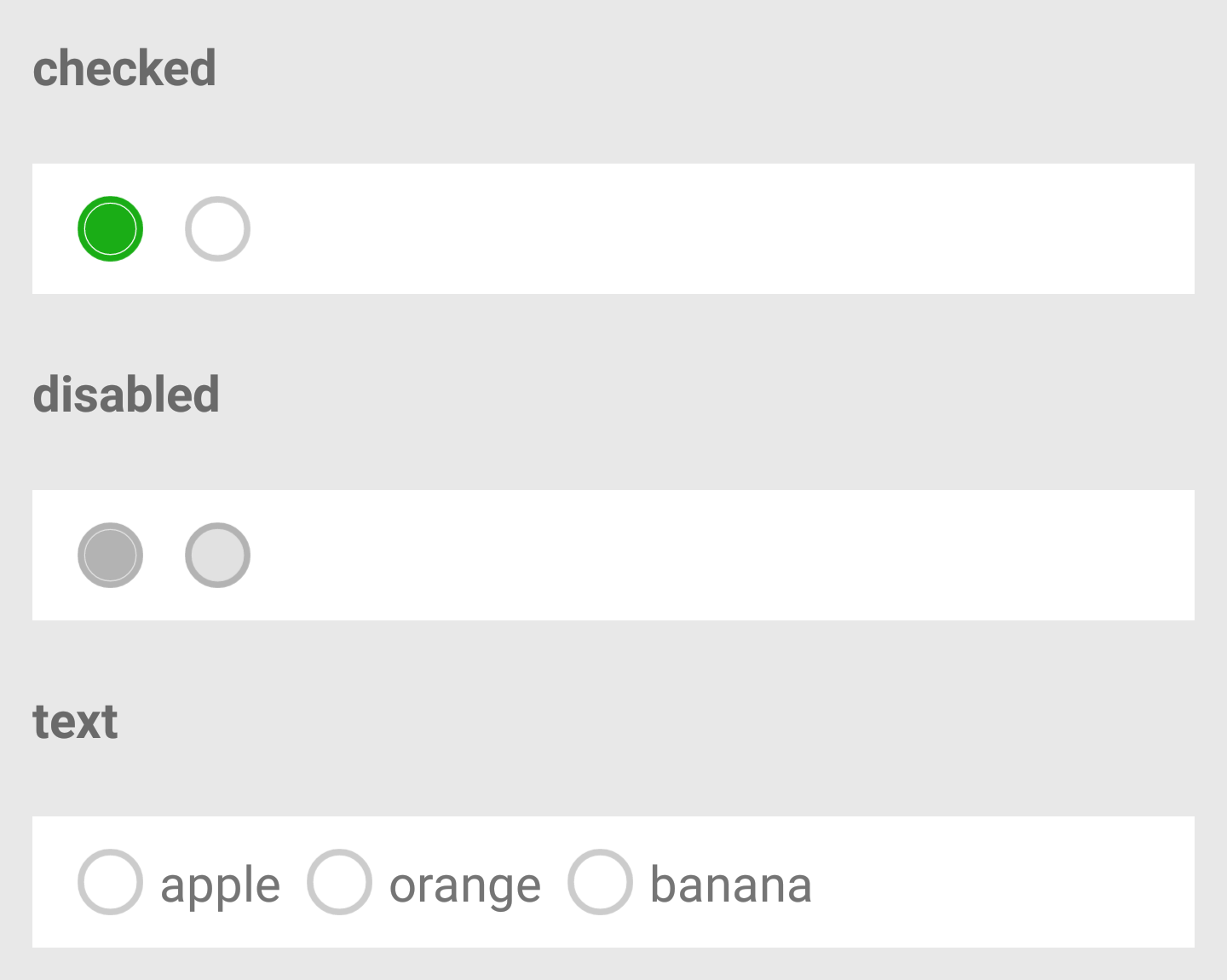
| checked | Boolean | false | false | 当前是否选中 | true | true | true | true |
| disabled | Boolen | false | false | 是否禁用 | true | true | true | true |
| value | String | false | '' | Radio 标识。当该 Radio 选中时,RadioGroup 的 onChange 事件会携带 Radio 的 value |
true | true | true | true |
| color | Color | false | #1aad16 |
Radio 的颜色,同 css 的 color |
true | true | true | true |
| text | String | false | '' | 显示的文本 | true | true | true | true |
| isRight | Boolean | false | true | 文本是否显示在 Radio 的右侧,默认显示在右侧 |
true | true | true | true |
| size | String | false | 'default' | Radio 的大小,有三种选项:large、default、small |
true | true | true | true |
示例
基本用法:
import React from '@react';
import XRadio from '@components/XRadio/index';
import XRadioGroup from '@components/XRadioGroup/index';
class P extends React.Component {
  constructor(props) {
    this.handleChange = this.checkboxChange.bind(this);
  }
  handleChange(e) {
    console.log('checkbox change', e);
  }
  render() {
    return (
      <XRadioGroup onChange={this.handleChange}>
        <XRadio
          checked={true}
          value="apple"
          text="苹果"
        />
        <XRadio
          checked={false}
          value="banana"
          text="香蕉"
        />
      </XRadioGroup>
    );
  }
}
export default P;