使用CSS的注意事项
因为快应用以flexbox布局为主,因此建议使用flexbox布局;不要用浮动定位;可以用绝对定位和相对定位(1040以上版本才支持的),但不支持z-index
注意点
样式的继承
快应用的样式的继承和 H5 类似,不过需要注意的是在快应用中其基本容器(div)所支持的样式及其有限(见上表)。
例如字体相关的样式只有 <text>, <span> 和 <a> 等组件支持并且它们都不支持 <div> 这样的块级子组件,所以对于字体的样式来说没法像 H5 那样自由的继承。
为了支持快应用下, pages目录下的样式表,不能@import pages目录下的其他样式表,也不能@import components目录下的样式表, 只能引用assets目录下的样式表。
components目录下的样式也是如此,想共享一些已有的样式,也能引用assets目录下的样式表,不要引用其他组件的样式表。
组件出现在伸缩盒项目位置时的处理
错误的写法
  <div style="display:flex; flex-direction:column;">
    <div>xxx</div>
    <anu-com><anu-com>
  </div>
正确的写法
  <div style="display:flex; flex-direction:column;">
    <div>xxx</div>
    <div>
      <anu-com><anu-com>
    </div>
  </div>
标签选择器要谨慎避开小程序专有的标签
为了兼容所有平台,尽量避免在CSS样式表中使用 只有小程序 才有的标签,如image, switch, scroller, scroll-div...
这些在小程序特有的标签可能会编译成div或view标签,导致样式失效。
垂直和水平居中
由于在快应用中元素组件默认使用横向 flex 布局,因此居中可以很方便的使用 justify-content: center 和 align-items: center 来实现主轴和交叉轴方向上的居中。
单位的转换问题
有的平台支持px与rpx,有的只支持px。但如果你不想转换px,你需要将px改成PX;
text标签的line-height 不能写line-height: 1; 快应用会自动加px 只能写 line-height: 52px; 这样 最近小米快应用本体可能有更新 导致之前样式ok的会挂 大家注意改下
flex 元素的宽度问题
当 flex 元素为垂直方向时( flex-direction: column),其宽度并不会默认占满父元素的宽度,有些情况下你需要设置 width: 100% 来然他满父元素的宽度:
<template>
  <div class="row">
    <div class="col">
      <div class="item"></div>
      <div class="item"></div>
    </div>
  </div>
</template>

<style>
  .row, .col {
    display: flex;
  }
  .row {
    border: 1px solid black;
    flex-direction: row;
  }
  .col {
    width: 100%;
    border: 1px solid red;
    flex-direction: column;
  }
  .item {
    border: 1px solid blue;
    height: 300px;
  }
</style>
样式表
| 名称 | 类型 | 默认值 | 描述 |
|---|---|---|---|
| width | <length> | <percentage> |
- | 未设置时使用组件自身内容需要的宽度 |
| height | <length> | <percentage> |
- | 未设置时使用组件自身内容需要的高度 |
| padding | <length> |
0 | 简写属性,在一个声明中设置所有的内边距属性,该属性可以有1到4个值 |
| padding-[left|top|right|bottom] | <length> |
0 | |
| margin | <length> |
0 | 简写属性,在一个声明中设置所有的外边距属性,该属性可以有1到4个值 |
| margin-[left|top|right|bottom] | <length> |
0 | |
| border | - | 0 | 简写属性,在一个声明中设置所有的边框属性,可以按顺序设置属性width style color,不设置的值为默认值 |
| border-style | dotted | dashed | solid | solid | 暂时仅支持1个值,为元素的所有边框设置样式 |
| border-width | <length> |
0 | 简写属性,在一个声明中设置元素的所有边框宽度,或者单独为各边边框设置宽度 |
| border-[left|top|right|bottom]-width | <length> |
0 | |
| border-color | <color> |
black | 简写属性,在一个声明中设置元素的所有边框颜色,或者单独为各边边框设置颜色 |
| border-[left|top|right|bottom]-color | <color> |
black | |
| border-radius | <length> |
0 | 圆角时只使用border-width,border-[left|top|right|bottom]-width无效圆角时只使用border-color,border-[left|top|right|bottom]-color无效 |
| border-[top|bottom]-[left|right]-radius | <length> |
0 | |
| background | <linear-gradient> |
- | 支持 渐变样式,暂时不能与background-color、background-image同时使用 |
| background-color | <color> |
- | |
| background-image | <uri> |
- | 暂时不支持与background-color,border-color同时使用;不支持网络图片资源,请使用本地图片资源;1010+版本支持9-patch图,详情见背景图样式 |
background-size 1000+ |
contain | cover | auto | <length> | <percentage> |
100% 100% | 设置背景图片大小,详情见背景图样式 |
background-repeat 1000+ |
repeat | repeat-x | repeat-y | no-repeat | repeat | 设置是否及如何重复绘制背景图像,详情见背景图样式 |
background-position 1010+ |
<length> |<percentage>| left | right | top | bottom | center |
0px 0px | 描述了背景图片在容器中绘制的位置,支持1-4个参数,详情见背景图样式 |
| opacity | <number> |
0xff | |
| display | flex | none | flex | |
| visibility | visible | hidden | visible | |
| flex | <number> |
- | 父容器为<div>、<list-item>、<tabs>时生效 |
| flex-grow | <number> |
0 | 父容器为<div>、<list-item>时生效 |
| flex-shrink | <number> |
1 | 父容器为<div>、<list-item>时生效 |
| flex-basis | <number> |
-1 | 父容器为<div>、<list-item>时生效 |
| position | none | fixed | none | 父容器为<list>、<swiper>时不生效 |
| [left|top|right|bottom] | <number> |
- | - |
示例
左中右分栏
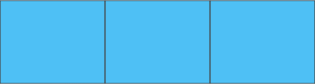
<template>
  <div class="main">
    <div class="cell cell--left"></div>
    <div class="cell cell--center"></div>
    <div class="cell cell--right"></div>
  </div>
</template>

<style>
  .main {
    display: flex;
    flex-direction: row;
  }
  .cell {
    flex: 1;
    height: 200px;
    background-color: rgb(78, 192, 245);
    border: 2px solid #444;
  }
</style>
上中下分栏
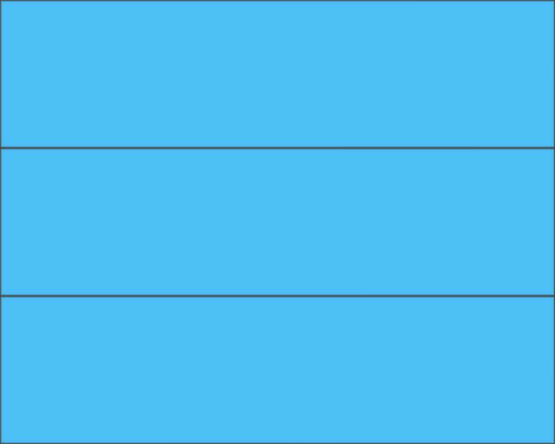
<template>
  <div class="main">
    <div class="cell cell--top"></div>
    <div class="cell cell--middle"></div>
    <div class="cell cell--bottom"></div>
  </div>
</template>

<style>
  .main {
    display: flex;
    flex-direction: column;
    height: 600px;
  }
  .cell {
    flex: 1;
    background-color: rgb(78, 192, 245);
    border: 2px solid #444;
  }
</style>
格子
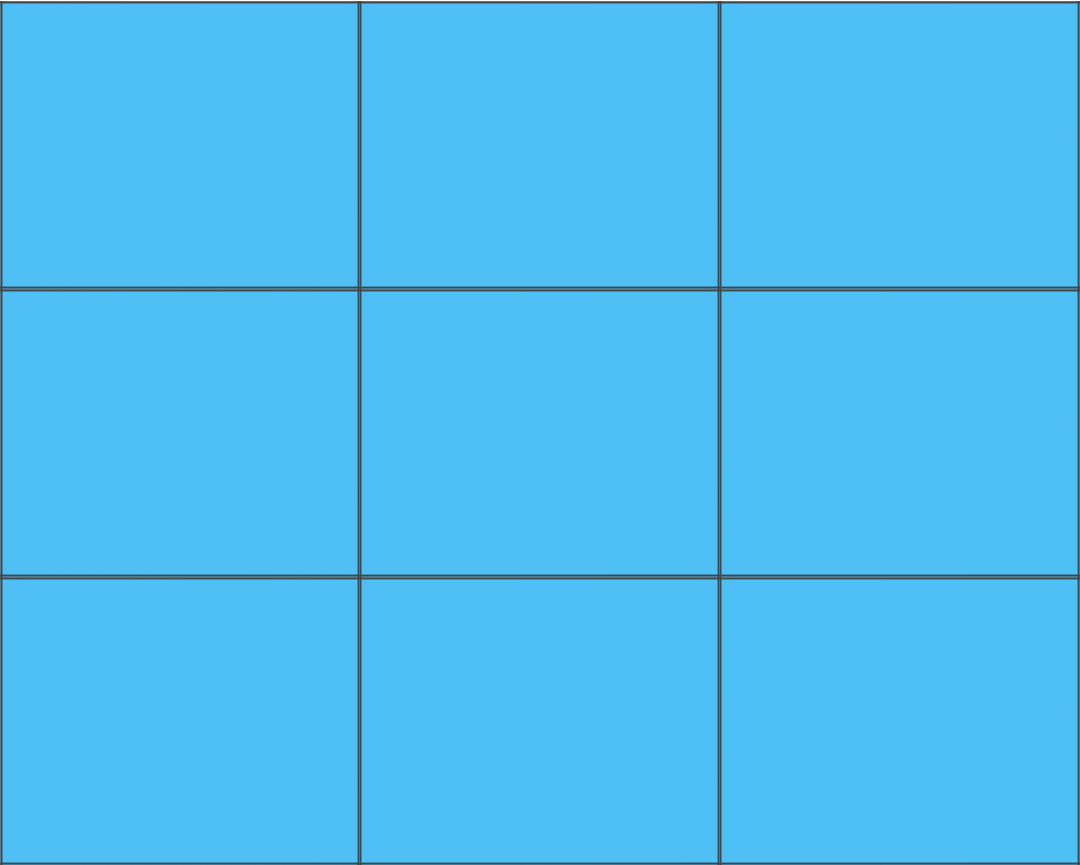
<template>
  <div class="main">
    <div class="cell"></div>
    <div class="cell"></div>
    <div class="cell"></div>
    <div class="cell"></div>
    <div class="cell"></div>
    <div class="cell"></div>
    <div class="cell"></div>
    <div class="cell"></div>
    <div class="cell"></div>
  </div>
</template>

<style>
  .main {
    display: flex;
    flex-direction: row;
    flex-wrap: wrap;
  }
  .cell {
    width: 33.333%;
    height: 200px;
    background-color: rgb(78, 192, 245);
    border: 2px solid #444;
  }
</style>
图片里面有文字

<template>
  <div class="stack">
    <image class="stack__cover" src="https://img1.qunarzz.com/order/comp/1808/c3/dda9c77c3b1d8802.png" />
    <div class="stack__content"><text class="text">Hero</text></div>
  </div>
</template>

<style>
  .stack {
    display: flex;
    flex-direction: column;
    align-items: center;
  }
  .stack__cover, .stack__content {
    height: 300px;
  }
  .stack__cover {
    width: 100%;

  }
  .stack__content {
    margin: -300px 0 0 0;
  }
  .text {
    color: red;
    font-size: 80px;
    font-weight: bold;
  }
</style>
由于快应用不支持 absolute 布局。对于图片里面有文字的这种堆叠样式可以使用负的 margin 或者背景图片来布局,不过需要注意的是快应用的背景图片暂时不支持网络资源。
上面就是一个负 margin 的实现,我们可以抽取出其中可复用的样式,把它变成一个 scss mixin:
@mixin stack($height) {
  display: flex;
  flex-direction: column;
  .stack__cover, .stack__content {
    height: $height;
  }
  .stack__cover {
    width: 100%;

  }
  .stack__content {
    margin: -$height 0 0 0;
  }
}
然后上面的样式就可以写成这样:
  .stack {
    align-items: center;
    @include stack(300px);
  }
  .text {
    color: red;
    font-size: 80px;
    font-weight: bold;
  }